ALEKSANDR SEMENOV


Designing a smartphone app that would assist post secondary students with time management.
MyFlowstate is a smartphone app designed to assist college and university students with time-management by letting them enter their assignment details into the app and divide major projects into simple step-by-step tasks which would be plotted onto a daily schedule. The app also assists with task prioritization by providing suggestions on which assignment to focus on based on its grade worth.
My Role: Lead User Experience Designer and Researcher
Tools Used: Figma, FigJam, Adobe Photoshop, Google Slides, Hand Sketching, ChatGPT.
Methodology: Design Thinking (Empathize, Define, Ideate, Prototype & Test)
Platform: Apple iOS.
Project Space: Educational application, time management, scheduling.
Design Challenge: Design a smartphone app that would assist post-secondary students with time management.
Constraints: Tight timeline of 8 weeks. Has to be worked on while learning UX/UI skills.
Limitations: No research budget. Limited pool of participants for primary research.

Project Introduction
Imagine this: You are a freshman at a college, living away from your parents for the first time ever! You attend your classes, spend time with your new friends, spend some time on your hobbies and try out new things.
The next thing you know, your assignments are due in a few days, exams are nearby, but you have not started yet. Suddenly you are scrambling to finish that one assignment as soon as possible! You are forced to skip sleep and work overnight to hopefully finish that assignment, submitting it just in time!
Sleep deprived, stressed due to approaching deadlines and unable to concentrate, you end up getting poor marks on your tests. Your professor advised you to learn better time management. But where and how?!
Photo by Siora Photography on Unsplash.
PART 1 - Empathizing with the Target Audience
The Problem Space
-
Time management is a huge issue for North American students in post-secondary education and can often lead to a variety of negative consequences such as failing grades, lack of attendance, or stress.
-
Over 70% of students admit that they struggle with time management and feel that they do not have enough time for coursework. Interestingly, 63% of students also wish that they had access to workshops or other ways to educate themselves regarding how to manage their time effectively.
-
Only 3% of college students are highly effective regarding managing their time. Which shows that the vast majority of students are not familiar or experienced with using various effective time-management strategies that could aid in their academic success.

Photo by Tony Tran on Unsplash.
Assumptions
Procrastination
With procrastination being cited as an issue for the majority of students, a big part of teaching time management is teaching to avoid procrastination.
Tell, Show, Practice
We can teach effective time management by telling people how to do it, showing an example, and letting them practice this method.
Setting Priorities
Teaching students how to prioritize certain tasks and activities is a good way to teach them how to make their time count.
Know Strategies, but Cannot Apply Them
Students may be well-aware of time-management strategies but do not know how to effectively apply them in practice.

Secondary Research
-
Around 78% of college students struggle with time management, Only 3% are seen as very effective with their time management.
-
Over half of students experience stress as a result of their poor time-management skills. Similarly, half of them feel overwhelmed by the course load.
-
Over 80% of students admit that better time management would improve their post-secondary experience, and the same 80% want to learn how to properly manage their time.
Primary Research
Interviews: After conducting secondary research, I also conducted a set of decontextualized interviews with 3 post-secondary students to gather primary research data. The participant criteria was:
-
Be an USA or Canadian resident or citizen.
-
Be a student of a North American college or university program for at least 4 months.
-
Or, have recently completed a NA college or university program, at most 2 years ago.
-
Does NOT have an advanced time management training through online courses or other sources.
-
Had not been expelled from post-secondary institution due to poor academic performance.
Most Notable Interviewee Quotes:
“I wait until the last day to finish assignments. Generally it would be a very long workday followed by a week of nothing.”
“I went through academic probation and learned [time management] through failures and learned to prioritize. That is how I managed. I had to learn it.”
“If an assignment is due on the same week or day, I will prioritize that. If the assignment is very important, I will prioritize that one. Because if its a 40% of course grade, is more important than 15%.”
Affinity Mapping
Strongest Insights:
Effective Task Prioritization
Effective time management involves writing down tasks and prioritizing them in an efficient way. For majority of students, it also involves focusing on projects which are due soon, or have big percentage contribution towards their total course grades.
Physical and Mental Wellness
Mental and physical wellness is very important for students. Most of them agree that there should be enough time for sleep and some recreational activities. However in some cases, hobbies and even sleep would be sacrificed to get important assignments done.

Now that interviews were done, I went through the process of affinity mapping to find common themes and insights from the interviews.
The main themes were: Physical and Mental Wellness, Outside Commitments, Effective Task Prioritization, Unhelpful Technology, Time Management is About Experience.
User Persona

Meet Steve, Steve Abbott is a college freshman who was not ready for the amount of coursework that he is expected to do. He struggles to get his assignments done on time, has to do homework at night, and thinks that he will not make it through college.
Steve is based on an average post-secondary student, and has some traits of our interviewees. However, unlike our interviewees, he does not have enough post-secondary experience to learn time management on his own. But needs help right now, or else he may fail his courses or give up due to stress and drop out!
PART 2 - Defining the Project
HMW Question
Based on my secondary and primary research as well as research insights and user persona, I can fully empathize with the target audience and asked the main question:
“How might we assist North American post-secondary students to prioritize their tasks in a way that improves their time management and allows them to fulfill their academic obligations without feeling stressed and overwhelmed?”
Experience Mapping

Opportunity Selection: Now it was time to create an experience map of Steve’s journey. This user journey is a bit unusual because poor time management is an ongoing, long-term issue for students and would come into play as weeks and months go by during a school year. Therefore, the experience map shows Steve’s journey through an entire college semester, approximately 4 months.
Most promising opportunities were: Help students make a study schedule, teach students to prioritize most important assignments first, and make a daily schedule which balances academic work and self-care.
User Stories:
Looking at the experience map, I drafted a list of user stories. Essentially situations which my target user would experience and which possible app features may help them accomplish that. From a long list of around 30 stories, I chose the theme of Building a Learning Schedule:
Main Story: “As a post-secondary student, I want to enter my assignments’ due dates and requirements so that I can get advice on which tasks and assignments to prioritize.”
Secondary Story: “As a post-secondary student, I want to have scheduled breaks between my study sessions so that I would be mentally relaxed and more productive.”
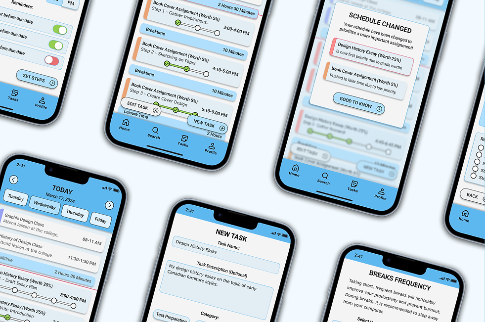
Task Flow Diagram

This task flow showcases an average post-secondary student’s use of the app. Where the student would record a new assignment into the app by entering basic info such as assignment name, due date, grade weight percentage and breaktime preferences. Afterwards, the app would notify the user that their task schedule is now changed to prioritize the new, more important assignment.
PART 3 - Design Ideation and Prototyping
UI Inspiration Board

While looking for visual inspiration for the app, I took the majority of inspiration from existing agenda and task schedule apps. Even though there are many schedule apps out there, many of them have visually complex or difficult to use timelines. In my app, the schedule timeline would have to look simple and clear so that there will be no confusion or learning curve. My intent is to make each page very quick to navigate, because post-secondary students should not be wasting time navigating through the app. User flow should be quick.
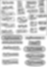
Sketches & Wireframes


Based on the inspiration board, I created a set of 3 exploratory sketches for each app page based on my user flow. From that, I chose 1 solution sketch per page that combines all the good elements of exploratory sketches. After exploratory sketches, I took the best elements of each sketch and created a set of refined solution sketches which could be used to build the first set of wireframes in Figma.


Afterwards, I created a set of grayscale wireframes in Figma which show the app's functionality and visual layout. It also represents a user's journey through the app: Check current tasks for the day, create a new task, adding assignment info and due date, setting a list of steps for the assignment, choosing how often to take breaks, checking if info is entered correctly. And lastly, seeing that schedule for the day was automatically changed because new assignment is more important. Afterwards the user would return to the updated schedule.
PART 4 - Testing the Solution
User Testing Sessions
To improve the usability of my app and test if current user flow actually works for the users, I asked a set of 5 individuals to go through my app wireframes and complete a set of 4 simple tasks:
Task 1: Inputting Basic Assignment Info
Task 2: Setting Assignment Due Date
Task 3: Selecting Subtasks & Break Prefs
Task 4: Finding the Updated Schedule
Session 1

Although all participants were able to complete each task without failing or getting stuck, their comments and confusion made it clear that certain design choices had to be reworked:
-
Dashboard which shows schedule has confusing visuals.
-
Subtask progress bars are misunderstood.
-
“Schedule Changed” modal is not informative enough.
After first round of user testing, I compiled a design prioritization matrix which lists issues that have to be solved prior to second round of user testing:
( 1 ) - Redesign the assignment progress bars. From horizontal lines to checkmarks?
( 2 ) - Tasks which have been passed should change color to look inactive.
( 3 ) - Remove vertical timeline bar and use different background color instead.
( 4 ) - Subtasks page should clearly show progress bars connected to individual subtasks.
( 5 ) - Schedule Changed pop-up modal needs a bit more info to clarify what changed.
( 6 ) - AM/PM selector should have shadow under un-pressed option.
( 7 ) - New tasks should have different colors.
( 8 ) - Add full colors.

Session 2

After improving my prototype and fixing the most glaring issues, I conducted another user testing session.
Second set of user tests went much smoother compared to the first, as users had less issues with the app. However, some issues persisted:
-
Subtasks page is still too text-heavy and confusing for some users.
-
Prototyper has a limited color scheme which makes certain elements hard to see.
-
Users are skipping certain entry fields or selections, possibly due to confusing visual layout.
After second round of user testing, I compiled another matrix which lists remaining issues that have to be solved in the final grayscale prototype:
( 1 ) - Increase text line distances on subtasks screen to make it easier to read.
( 2 ) - Replace checkmarks on subtasks screen with another icon.
( 3 ) - Add a visible line to the timeline background to make the feature more clear.
( 4 ) - Add more grayscale color variety to the app pages to improve visibility of certain elements.
( 5 ) - Tweak the layout of Confirmation and some other pages to improve readability.
( 6 ) - Make all CTAs longer and darker to make them easier to see and click on.
( 7 ) - Thicken the colored line for all tasks so that it's easier to see.

Improved Prototype


Now that my wireframes underwent multiple rounds of user testing and improvements, they became a refined prototype that is easy to navigate and use, and now only need to be colored and finalized.
PART 5 - Finalizing the Design
Visual Identity Story
Brand Adjectives & App Name
To create a brand story and color scheme for my app, first I had to create a visual brand identity. I selected a few adjectives which represented my app brand:
Calming - Because students should feel at ease about their assignments while using the app.
Organized - As my app helps people stay on track with their assignments.
Supportive - This app should assist and help students achieve academic success.
Motivating - This app would motivate students to stay on track and continue on.
Inspiring - The app shows students that they can indeed achieve success in their education.
Afterwards I created a long list of potential names for my app. Settling on a few good ones and checked if they are already taken or not. Eventually, I chose to name my app: MyFlowstate
“My Flowstate” fully embodies the aim and functionality of my app:
“My” stands for the person using the app, a student who wants to do things on their own terms, in a way that works for them.
“Flowstate” relates to a psychological state where a person is fully immersed in their task and feels energetic and inspired while doing it. This is what my app aims to achieve.
Wordmark
While designing a wordmark I did multiple sketches on paper and in Figma, I eventually concluded that the word “MyFlowstate” in a Segoe Print typeface with a simple bent line running underneath gives the best abstract feeling of being “in the flow”.
This simple logo would also appeal to young adults because it has a fresh feel unlike other complex traditional-looking styles.
Black on White Version:

White on Black Version

Moodboard


I created a visual moodboard that symbolizes my chosen brand adjectives.
This moodboard was used to select a set of colors for my app. Multiple sets of 60-30-10 color combinations were made and tested, eventually settling with gray primary color, light blue brand color and accent color, and black as neutral and functional color.

App Icon
This was also the point where I created my app’s icon. Eventually I chose to settle with merged M and F letters which used same font as the app’s wordmark.
This made the app icon connect with the wordmark and also looked very noticeable at a glance as a fancy symbol.
App Icon:

Unused Alternative:

Final App Prototype


Finally, it was time to fully color the app prototype. I added color to each object and element of the app. Following the established color combination of 60 neutral, 30 blue and 10 neutral. Besides these main colors, I also introduced a set of secondary colors for on/off switches and task color selectors.
User Needs Addressed:
This final prototype showcases an average user's interaction with the app, a user flow which starts on the daily schedule screen and goes through the process of adding new assignment. The current functions are addressing vast majority of user needs:
Daily Schedule
Dashboard of the app is essentially a daily agenda which shows the user what task to work on at any given time. New tasks can be added, edited, or removed.
Assignment Entry
User is able to enter assignment details, due date, and split it into multiple simple steps so that even complex assignments would be simple to go through.
Student Health
The app asks user how often they prefer to take breaks between tasks so that they can relax and avoid burnout. The app would also schedule 8 hours of sleep for users no matter what.
Task Prioritization
To make sure that the user is focusing on most important assignments, the app would prioritize assignments with greater course grade worth or approaching due dates.
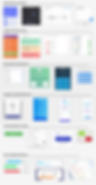
UI Library

After finalizing the app, the colors and visual language, I created an UI library which contains my app’s elements and all other building blocks. In a way, this is my app’s design system which can be used to build more pages onto my app.
Accessibility Considerations


Since my app is meant to be used by the general audience of post-secondary students who have unique needs and limitations, I did my best to make my app accessible to as many people as possible.
This was done by using UI color combinations which fit into AAA accessibility requirements. Besides, I used Roboto typeface for titles and larger app text due to its ease of readability and Verdana typeface for smaller text to improve readability of smaller body text.
App Marketing Website

As the last part of MyFlowstate app design, I have developed a marketing website to accomplish a few goals:
-
Create awareness and market my app to potential customers.
-
Showcase the features of the app.
-
Explain how my app would help customers overcome their issues.
-
Communicate my app’s brand values to the people.
-
Introduce my app to the public in an effective and engaging way.
The website was developed through the same process of Design Thinking where I first figured out what visitors would be looking for after entering the website. Next I defined the content which would be shown on my site. Next I created paper sketches, solution sketches and grayscale wireframe followed by two prototype iterations. Fellow designers got to view the prototypes and suggested a set of 8 changes which I implemented.
This eventually became a responsive marketing website for my app which outlines the app’s features, reviews, comparison to competitor apps and a FAQ section. You can read a full case study of the app marketing website in the upcoming website update sometime in late April 2024.
Multi-Platform Challenge

To consider other ways in which MyFlowstate app users may want to engage with the app, I went back to the experience map of Steve Abbott, the persona for this project, and walked through his daily journey. I quickly realized that as a college student, he is very likely to attend his classes with a laptop and / or use a desktop computer at home or college library to do his homework.
Thus, a desktop web application is the best second choice for a platform for MyFlowstate app. As huge number of North American students come to class with laptops and also do homework on laptops or desktops. It would be very convenient for the users of my app to do homework on a laptop and have the schedule open in another window for a reference. Or perhaps have the app on both smartphone and laptop, so that they can enter assignment details through the desktop app and afterwards check it on their phone.
Speculations on Design Impact & Future Thinking

The Superfan:
How would a community of your most passionate users behave?
Answer: With an application that is meant for young adults, there would indeed be a lot of fans who would use my application in extreme or unintentional way due to finding it super useful and fun. As an example, people may try to “speedrun” their assignments by intentionally setting lowest possible timers for each project to try completing it as fast as possible, or competing with their friends for fastest project completion speed using my app. As a fun thought: Some fans may try to use this app for unintended purposes, such as scheduling personal tasks and hobbies onto their timetables.

Radio Star:
Who or what disappears if your product is successful?
Answer: Since my app primarily acts as a schedule or agenda application and study help, it is in a direct competition with all other scheduling and study support apps for post-secondary students. Assuming that my app becomes very successful, many other study apps and school agenda apps would lose popularity and possibly go out of business. And yet, my app has a very specific set of functions that may or may not be helpful for certain students. Which means that my app will occupy a specific niche and place in the market. In some cases, my app may be offered by some colleges and universities to their students as a study help, which would give me an unfair advantage.

The Catalyst:
How might cultural habits change how your product is used? And how might your product change cultural habits?
Answer: My app is designed for college/university students most of whom are young adults who have a very distinct subculture. One thing which comes to mind right away is a very common culture of “pulling all-nighters” by college students. Since my app is built specifically to improve time management and avoid cram nights, the cases of students pulling all-nighters may decrease. Although, since all-nighters are still a beloved practice among students, they may still decide to pull all-nighters regardless to party or do hobby activities. On a good note, if my app becomes popular, it would improve student performance and physical health by improving their grades and sleeping habits.
Key Learnings:
Working on a Tight Timeline
-
I became comfortable with working on a tight timeline.
-
Learned how to work quickly and efficiently by prioritizing the overall quality of final product.
-
Not overthinking small details and instead focusing on the bigger picture.
Full UX/UI Design Process
-
Capstone project in BrainStation bootcamp
-
Defining the problem and performing design research.
-
Empathizing with target user and designing the solution to fit their needs.
-
Documenting the entire process from start to finish.
Colors and Brand Identity
-
I learned how to develop a brand language and color scheme for my application.
-
There is a specific process to deciding which colors would be the best for the app.
-
Its always based on the needs of target audience and brand identity. Not simply what looks good.
Next Steps:
This project have been one of my favourites to work on and it taught me a lot about UX design process, human-centred thinking, user testing and much more. Yet a design is never "complete", and there are a few more things which I would like to explore:
1st - Accessiblity
This app is designed for all post-secondary students and should be usable to as many people as possible. I would like to improve app's accessibility by revising typeface choices, text size and adding textures to color markers to make sure that the app would fit the needs of all users.
2nd - Functionality
While the current set of functions already fulfills the main needs of the target users, I am considering a few more functions that would make user experience better. For example allowing users to fill project requirements by holding their camera over an assignment sheet.
3rd - Viability
Being in touch with software engineers, I would like to discuss the possibility of developing this app and bringing it to the market through Apple App Store. Topics of discussion would include the development cost, time, infrastructure requirements, and security.