ALEKSANDR SEMENOV


Designing a responsive marketing website to advertise MyFlowstate app.
MyFlowstate Marketing Website is a responsive web site which advertises the aforementioned student time management app to potential users. The website is available in desktop widescreen and mobile versions, and its primary function is to showcase MyFlowstate app's features, show how it compares to other similar apps, and answer a few common questions.
My Role: Lead User Experience Designer and Web Designer
Tools Used: Figma, Adobe Photoshop, Google Slides, Hand Sketching.
Methodology: Modified Design Thinking (Define, Ideate, Prototype & Test)
Platforms: Apple iOS Smartphones and Desktops.
Project Space: Website design, marketing, graphic design, branding.
Design Challenge: Design a responsive marketing website which showcases MyFlowstate app functionality to potential users.
Constraints: Extremely tight timeline of 1 week. Must be a single-page site. Must have same content for both mobile and desktop versions.
Limitations: No research stage. Single round of user testing.
Project Introduction

Website Use Case: In addition to designing MyFlowstate App, a smartphone application which assists post-secondary students with time management, I also had to develop a responsive marketing website which has a desktop version and a mobile version in order to accomplish a few goals:
-
Introduction - Introduce my app to the people in an effective and engaging way.
-
Create Awareness - Showcase my app as something that exists and market it to potential users.
-
Feature Showcase - Show what functions and features my app has.
-
Explain Benefits - Tell the potential users how my app can solve their issues.
PART 1 - Defining the Website's Contents
A Set of Requirements
Overall, the marketing website should give readers a good idea of what MyFlowstate app does, what makes it good, and if this app may be the right fit for them. To make this happen, I outlined a list of things which must be present on the website:
Hero Page
As people land on the site, they should be greeted by an interesting image and a catchphrase.
List of Features
After the hero page, there should be a list of app features with visuals to show people what the app does.
Social Proof
The website should also show user reviews and awards to show the viewers that this app is effective.
Comparison Chart
FAQ Panel
There must be an FAQ panel which contains answers to frequently asked questions about the app.
Consistent Branding
The desktop and mobile versions of the website must have similar color scheme as MyFlowstate App itself.
Website User Persona

Since MyFlowstate app is meant for post-secondary students, so is the marketing website which they may stumble upon while looking for solution to their time management issues. So, I am referencing exactly the same persona while designing the website as I did while developing the app itself. Steve Abbott is a college freshman who was not ready for the amount of coursework that he is expected to do. He struggles to get his assignments done on time, has to do homework at night, and thinks that he will not make it through college.
As Steve is a college student who undoubtedly uses Google or other search engine to find information, it is certain that he will learn about MyFlowstate app by first stumbling upon the marketing website. Thus, the website should convince Steve that the app would assist him with time management.
PART 2 - Design Ideation
Website UI Inspiration


After outlining the purpose and required content of my website, I created an inspiration board by gathering visual references of how app marketing sites are structured and what the best and most effective practices are. Notably, I was very curious as to how other sites handle the design changes between desktop and mobile versions.
Moodboard

Since the marketing website is an extension of MyFlowstate app, I expanded the moodboard from that project and added to it.
To make sure that website would fit in with the visual feel and “vibe” of the app and appeal to post secondary students, the visual themes that I chose are:
-
Simple yet organized gray tones.
-
Dynamic wavy or smoke-like textures.
-
Both organic and geometric shapes.
-
Primarily greyscale and blue colors.
Concept Sketches


As I was creating quick sketches of potential layouts for desktop version of website, I referred back to website UI inspiration boards to make sure that I am including tried and tested elements and layouts. For mobile version of the site, I attempted to redesign the desktop versions to fit into mobile resolution while also condensing the space required for certain UI elements. Such as replacing feature sections with carousels.
Solution Sketches


Solution sketch for desktop version of the site includes all the elements from concept sketches which I thought were the best. Notably: Gradient on hero image, big feature section with one feature per page, awards and reviews for social proof, detailed comparison chart, clean dropdowns for FAQ and small footer with minimum clutter.
Mobile solution sketch somewhat mirrors the desktop solution sketch but attempts to conserve space: Simplified hero page layout, features section is a carousel, social proof section remains the same, comparison chart now has carousel for competitors, FAQ remains the same, footer may feature another download CTAs and social media links.
PART 3 - Prototyping & Testing
Wireframes

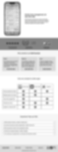
Desktop Wireframes: Based on gathered references and solution sketches, I created a set of rough desktop wireframes for the marketing website. For the desktop site, I chose to take up lots of space to show app’s functionality. And it also gave me a good understanding of how much content I am working with.


Mobile Site Wireframes are based on the desktop version in terms of visual content presentation. To make good use of smartphone screen space and interactive functions, I made use of horizontal carousels in the feature showcase and comparison chart sections.
A/B Testing Prototypes


To make sure that both the desktop and mobile versions of the website are effective in terms of visual presentation, layout and color choices, I decided to conduct a short A/B testing session where I would present two variants of desktop and mobile prototypes. First (A) prototypes are simpler and closely resembles MyFlowstate App's colors. While second (B) prototypes are more experimental and dynamic in terms of visual layout.
A/B Testing Session
To improve the visual design and usability of my app marketing website and to test which variants are more effective in presenting the app functionality, I asked a group of 5 fellow UX designers to look through both A and B prototypes and make comment on what works well and what needs improvement.

After having peers review both A and B versions of desktop and mobile website and give feedback, it became clear that B versions are more visually engaging and successful. Now focusing on B versions, I created a list of 8 improvements:
-
Make navigation bar sticky to top of the page.
-
Change site background to lighter blue.
-
Make awards smaller and place them onto auto-scroll carousel.
-
Increase font size, at least 15-16 with 16pt padding
-
Add heavier shadow on features images
-
Stars on feedback should be yellow.
-
Put competitor apps into grayscale.
-
Add a QR code to download links.
Improved Prototypes


Thanks to peer feedback during A/B testing session and all the improvements, I created the final versions of desktop and mobile marketing website. Notably, the final prototype has a softer background color to make all visual elements stand out more. Better text spacing and size makes the text easier to read and more accessible, while the overall better spacing makes the site easier to go through.
The final mobile version of the website has many interactive elements such as carousels showcasing app features, made-up awards, and competitor products. While the collapsible FAQ section is made to look big and simple to make sure that its easy to read while on mobile.
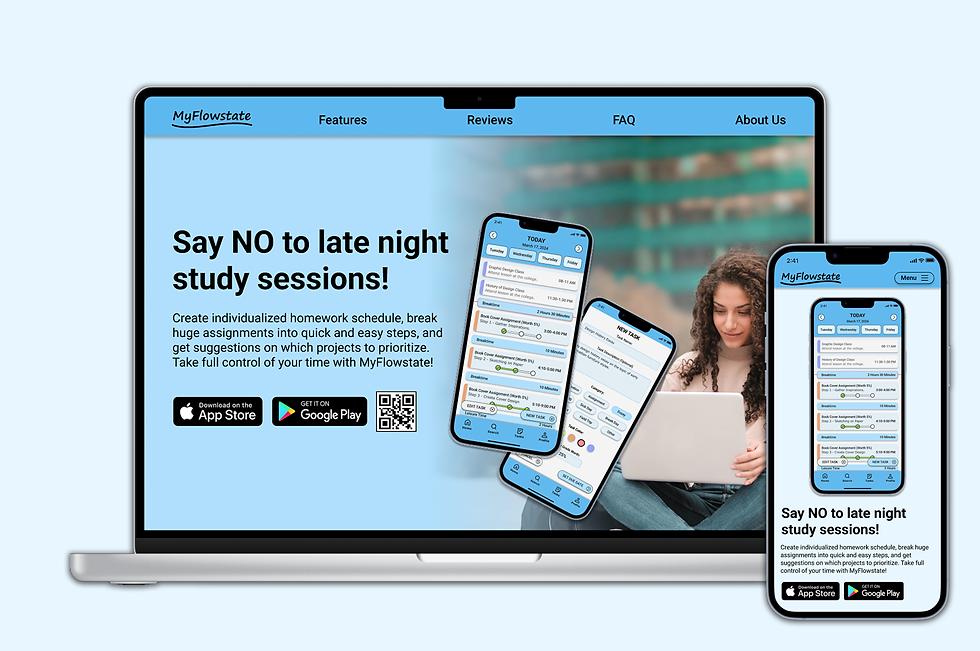
Finalized Designs


Finalized Desktop Prototype: Based on B variant from A/B testing and undergoing a range of improvements, the desktop version of the website features a big "hero screen", followed by in-depth explanation of MyFlowstate App functions, a set of 3 made-up awards to show how awards may look like on the page, a set of app reviews from users, a feature comparison and a short FAQ section.


Finalized Mobile Prototype: Also based on the B variant from A/B testing session, it underwent similar improvements as the desktop prototype. To save space, I chose to showcase features on a 4-step carousel. Similarly, the made-up awards are also placed onto an automatic carousel. The reviews are placed into neat boxes, while app comparison shows a single competitor app at a time, user can switch between comparisons. Lastly, the FAQ section now has larger text and longer collapsible menus to make it more readable.
Design Requirements Addressed:
The final prototypes of the marketing site fulfills all the requirements outlined in the beginning of the project. Having a hero page, a list of features, social proof, a comparison chart, FAQ panel and consistent branding. Other advantages of the site include:
Responsive Site
As per requirement, this website has a desktop version that is meant to be viewed on a larger computer screen and a mobile version. Thus giving a good experience to users of both viewports.
Simple & Effective
This website is designed to look simple and straight to the point. As majority of visitors do not have much time, they would be given a quick overview of the app and ways to quickly download it.
A Good Overview
While the website is meant to showcase the app as efficiently as possible and be easy to scroll through, it is still a good overview of the app for people who like to slow down and read everything.
Content Flow Diagrams


This website was designed with a specific content flow in mind. Namely, having a navigation bar, hero image to introduce the app, a showcase of features, social proof to convince the reader that the app is effective and trustworthy, a comparison between MyFlowstate and competitor apps, a frequently asked questions section and a footer with additional readings.
Key Learnings:
Building a Marketing Website
-
I learned how to use app's brand language while developing a website.
-
How to showcase a product's features in an effective way.
-
Creating an impactful content flow to convince the viewer.
Responsive Design
-
I learned how to build responsive websites which would look good on desktop and mobile.
-
How to showcase same content on a widescreen desktop and small, vertical mobile screen.
-
Take advantage of desktop and mobile capabilities.
Simple But Impactful Visuals
-
I learned to focus on website's main purpose rather than flashy visuals.
-
A good marketing website is the one which can convince people.
-
Having too much information and visuals would only distract people from actually getting the app.
Next Steps:
This project had a very short timeline of 1 week, yet it was enough time to develop a good-quality prototype which fulfills all project requirements and can be passed to developers. Yet there are a few areas which I would work on as time permits:
1st - Refinement
Since this project only had a single round of A/B testing, I would like to conduct a second round of testing with the target audience to improve the site and make it more appealing for them.
2nd - Interactivity
I would like to add a few more interactive elements to both the desktop and mobile versions of the website, such as interactive buttons or other visual elements.
3rd - Expansion
While this website is meant to only have a single main page, I am thinking of adding 1-2 other pages which would act as "further reading" for people who are interested in the app.